Ritual App Design
This app design is a product of my General Assembly User Experience Program. We were tasked with the assignment of choosing any area of interest and to develop an app based on the ideal user’s needs. I was solely responsible for each step of the process from ideation to interaction.
As one of the most rewarding educational experiences I’ve had thus far, this app creation is a meld of my passion for wellness and rooted in health communication. It approaches health and wellness by meeting users at their fingertips and making meaningful connections to medical professionals. With the goal of supporting a variety of public health needs, it aims to bridge the gap between provider and patient.
SKILLS NEEDED
Figma, User Research, User Interactive Design
CATEGORIES
User Experience Research & Design
COPYRIGHT
Pramiti Singh
THE PROBLEM
People who are trying to invest in their health find it difficult to sustain motivation and find trustworthy support for long-term wellness goals.
THE HYPOTHESIS
I believe that by creating a mobile application that motivates people with realistic goal setting prompts, tracking their progress and supporting their journey with access to experts and accountability partners, people will reach their wellness goals.
We will know this to be true when the user uses the app, creates and reaches goals, engage with the online community board, tries group challenges and interacts/shares on social media.
THE RESEARCH GOALS
How do people like to get their health information?
What are their motivations?
Are there barriers? Is it difficult to get your health information?
What sources do they they trust information from?


RESEARCH FINDINGS
After, doing a competitor analysis and feature inventory, I was ready to build an affinity map and persona. This narrowed down our ideal user and their wants and needs.


REVISED SITEMAP
Doing both an open and closed card sort helped me determine where the user would search for specific features in the app. This led to a revised sitemap.


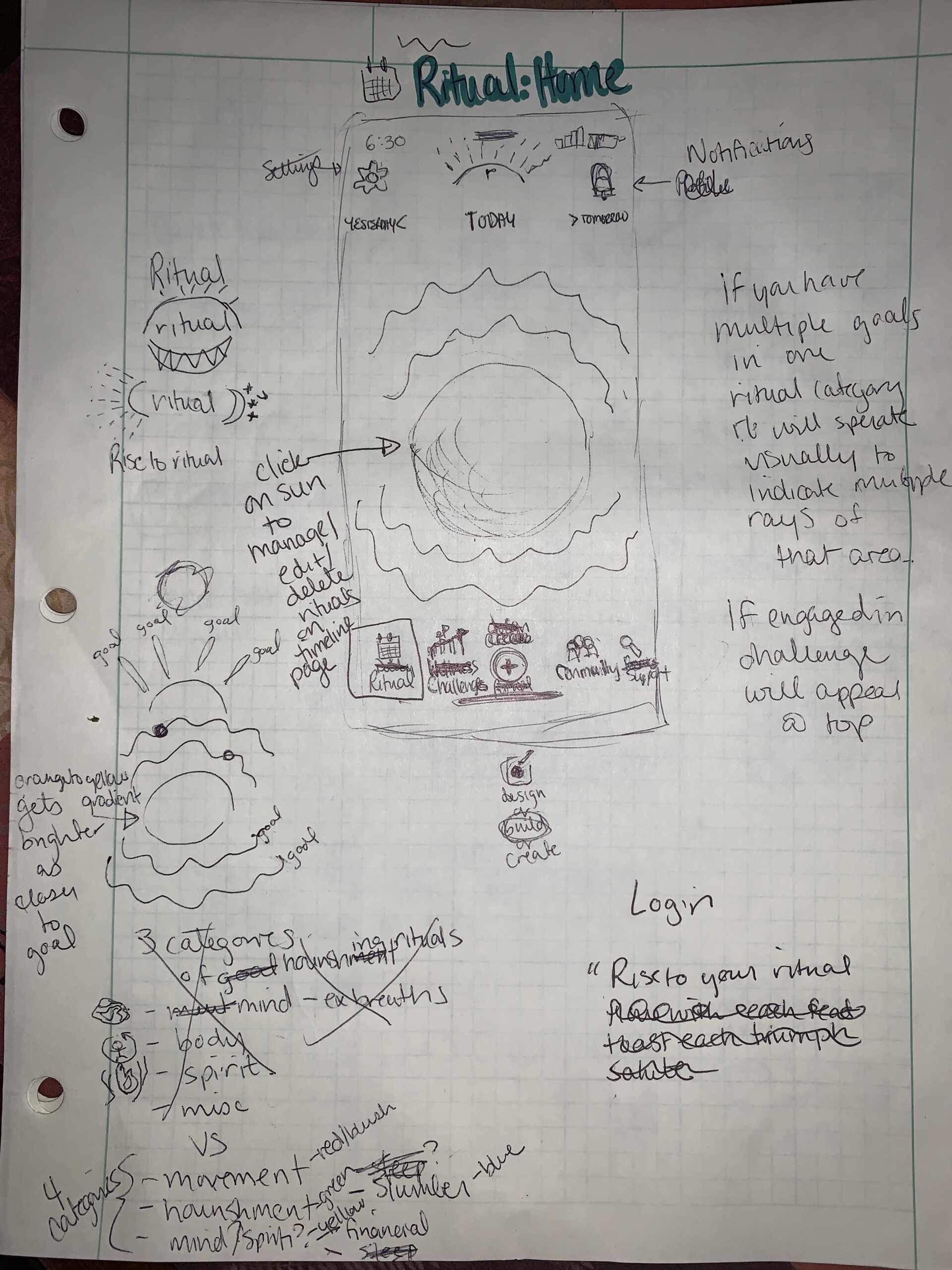
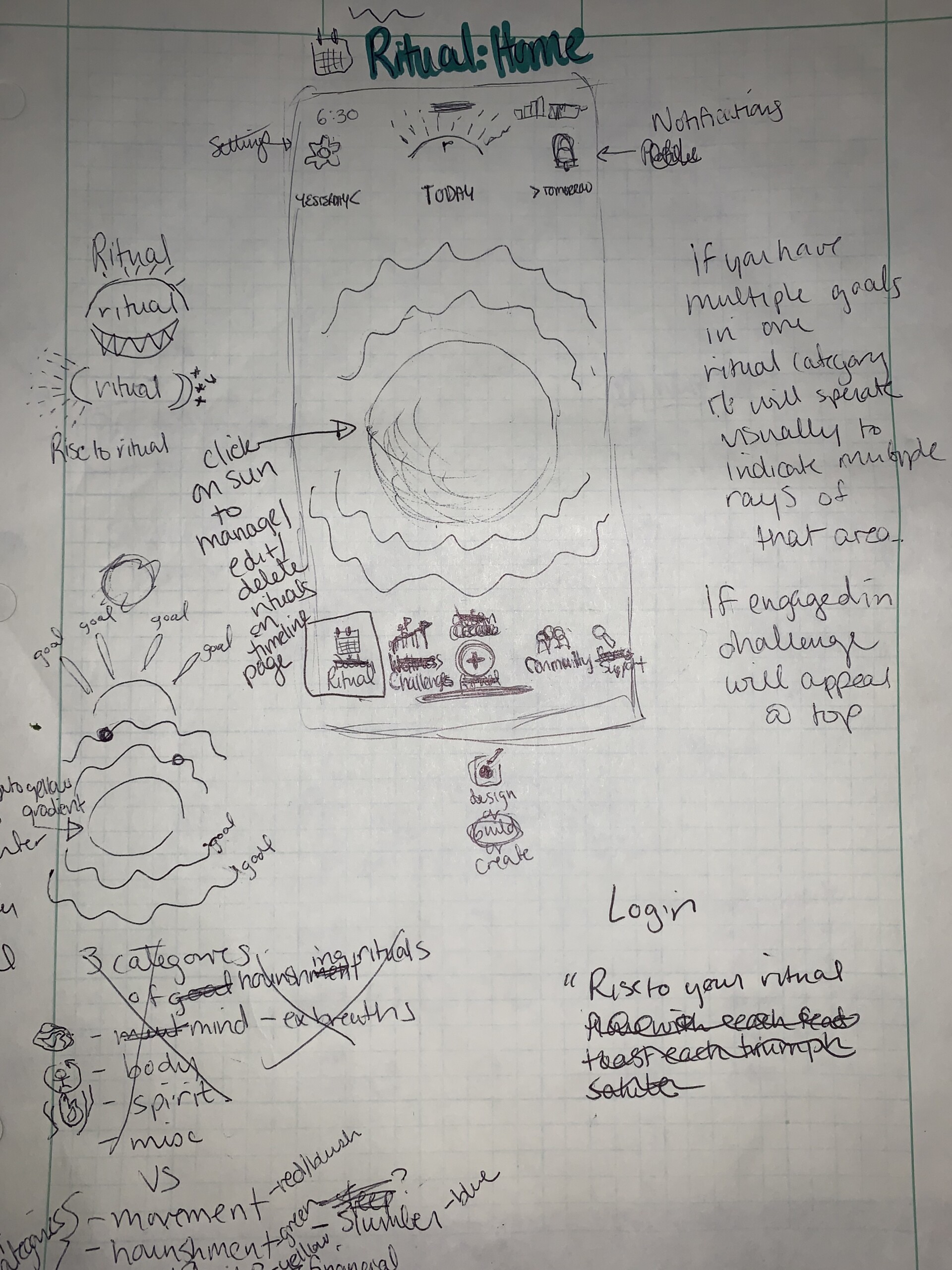
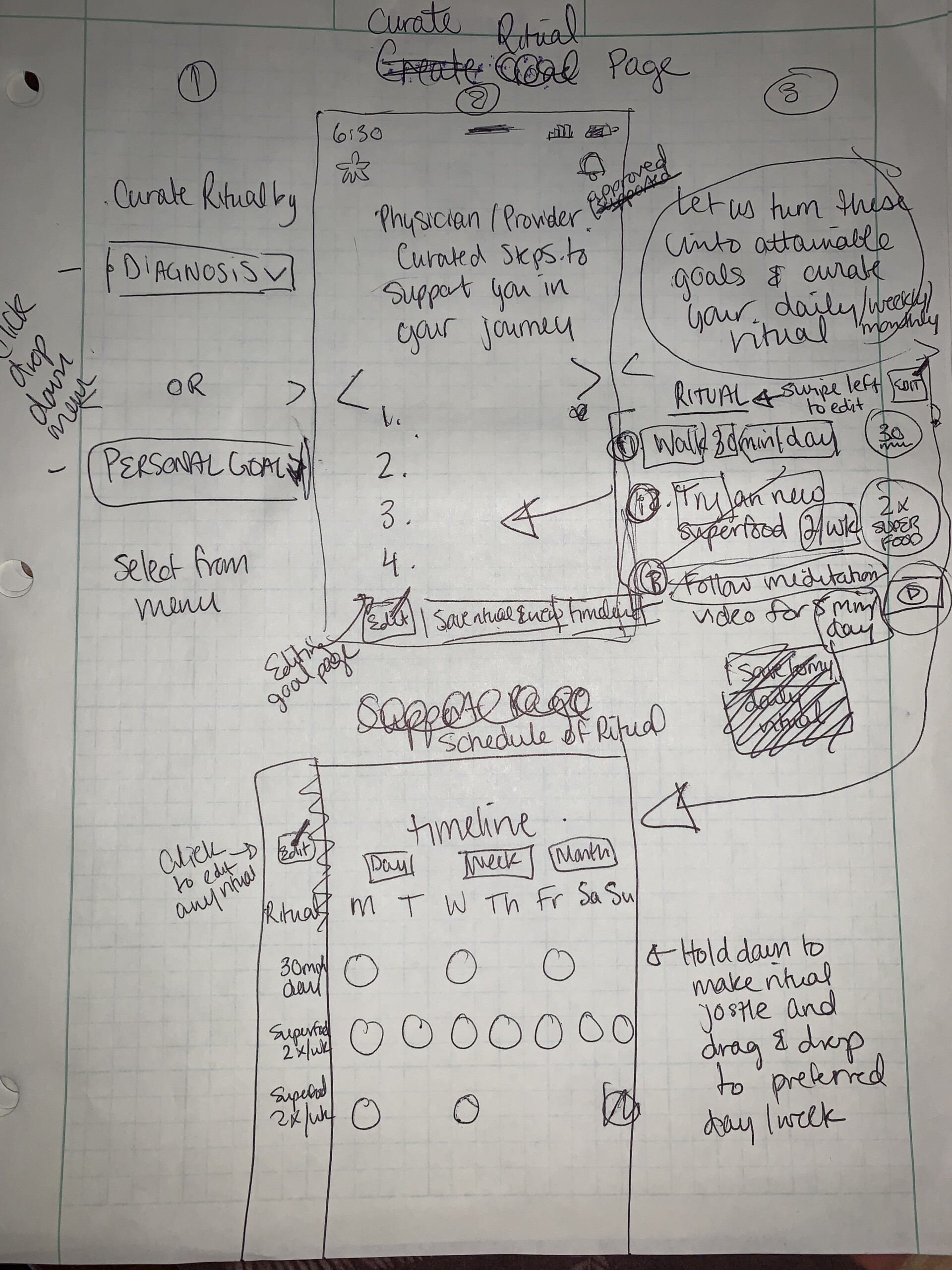
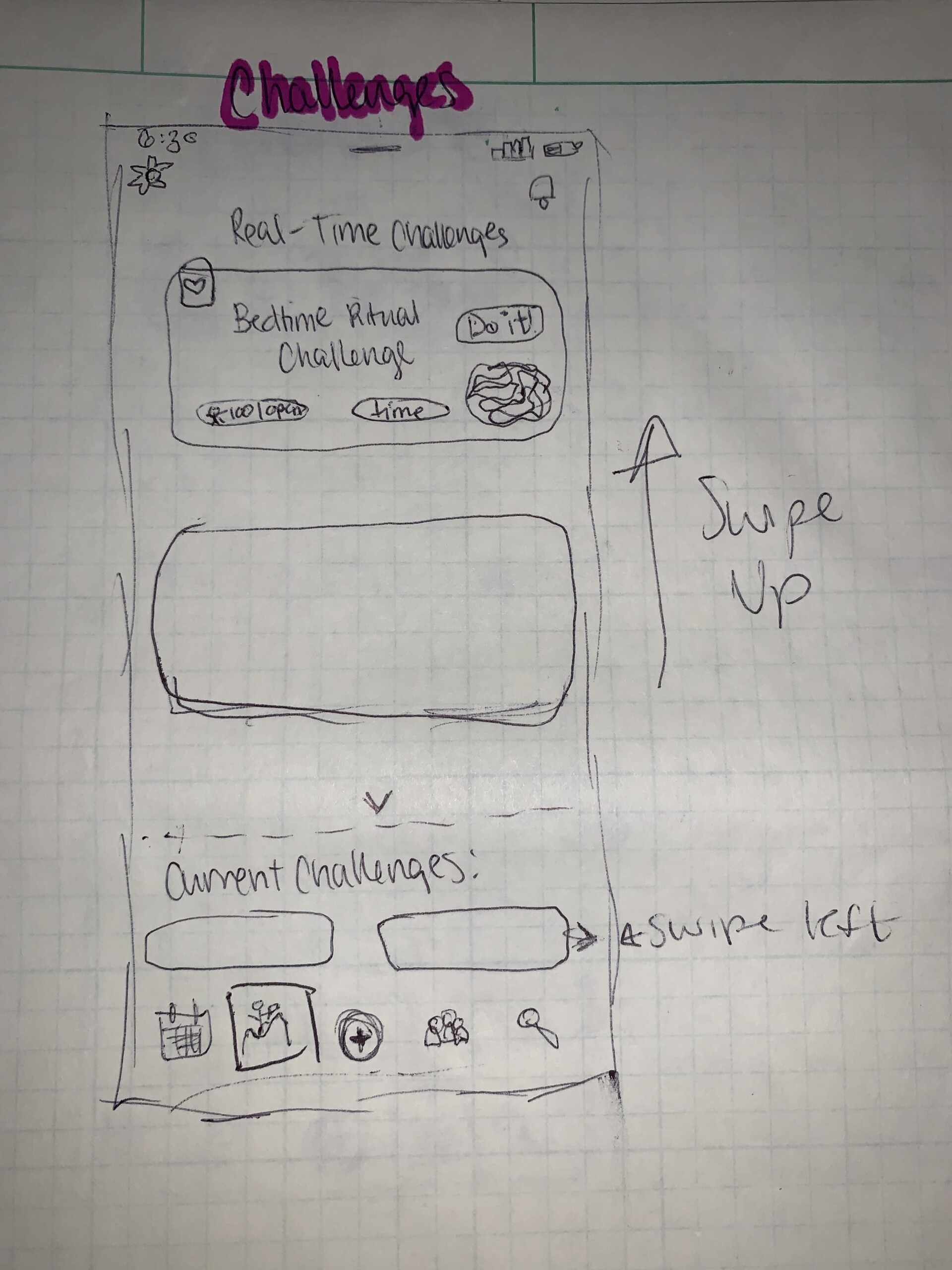
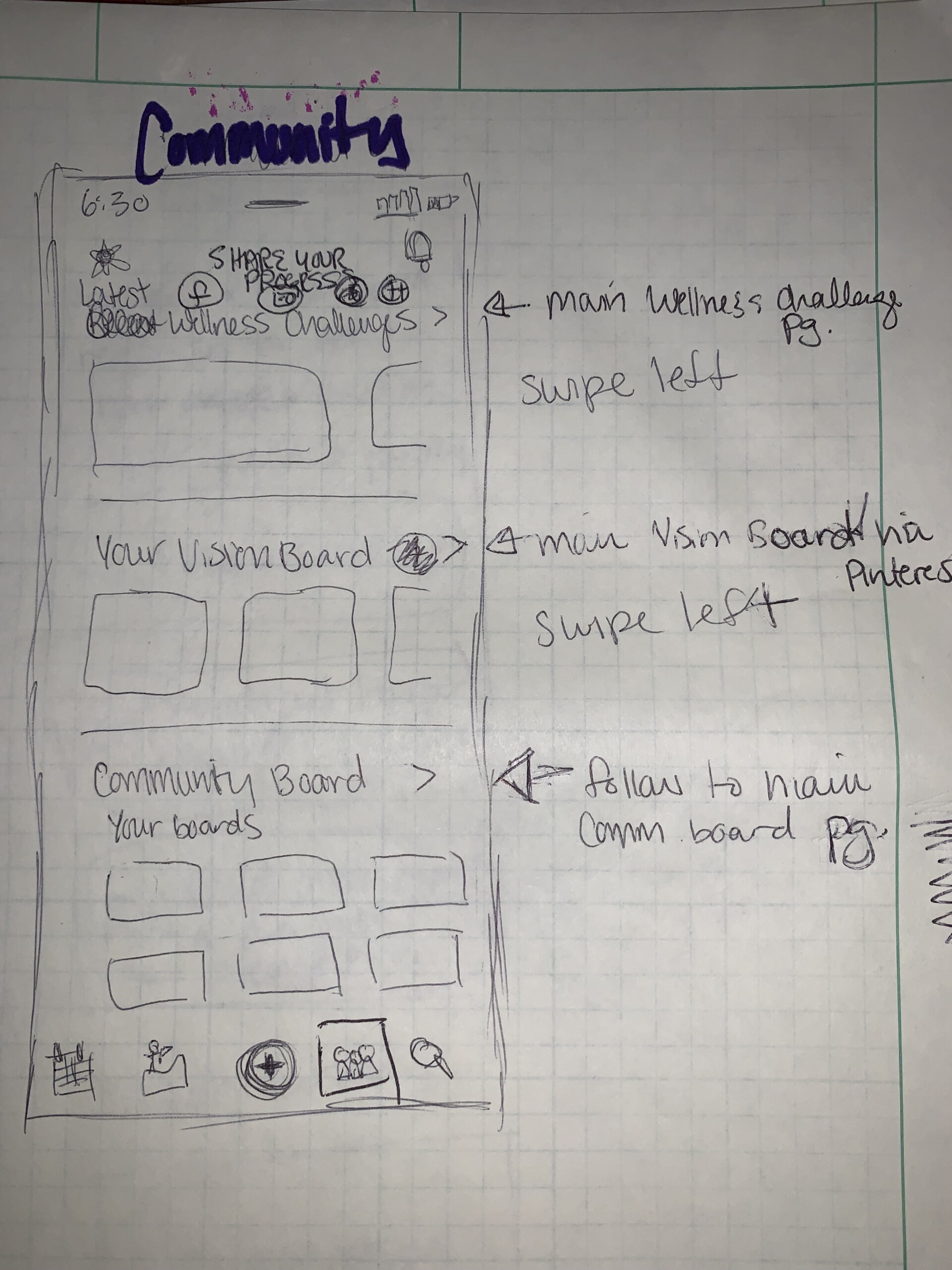
SKETCHES
Finally, with a revised sitemap, I could begin the sketches. Forgive the messiness – there were many MANY edits.
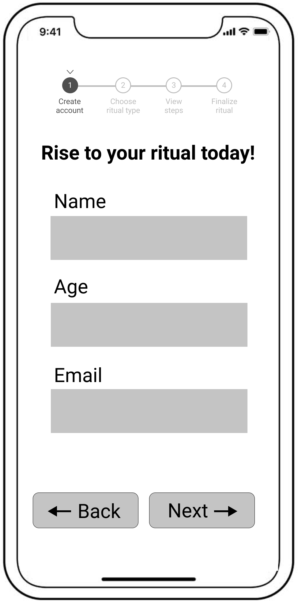
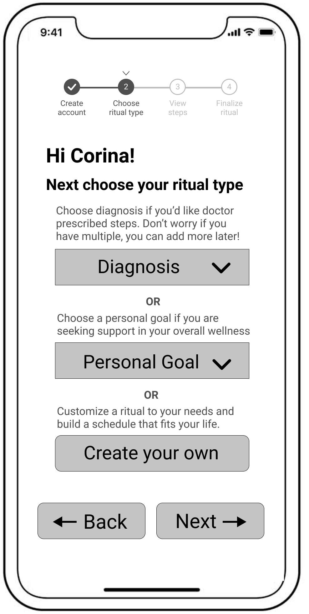
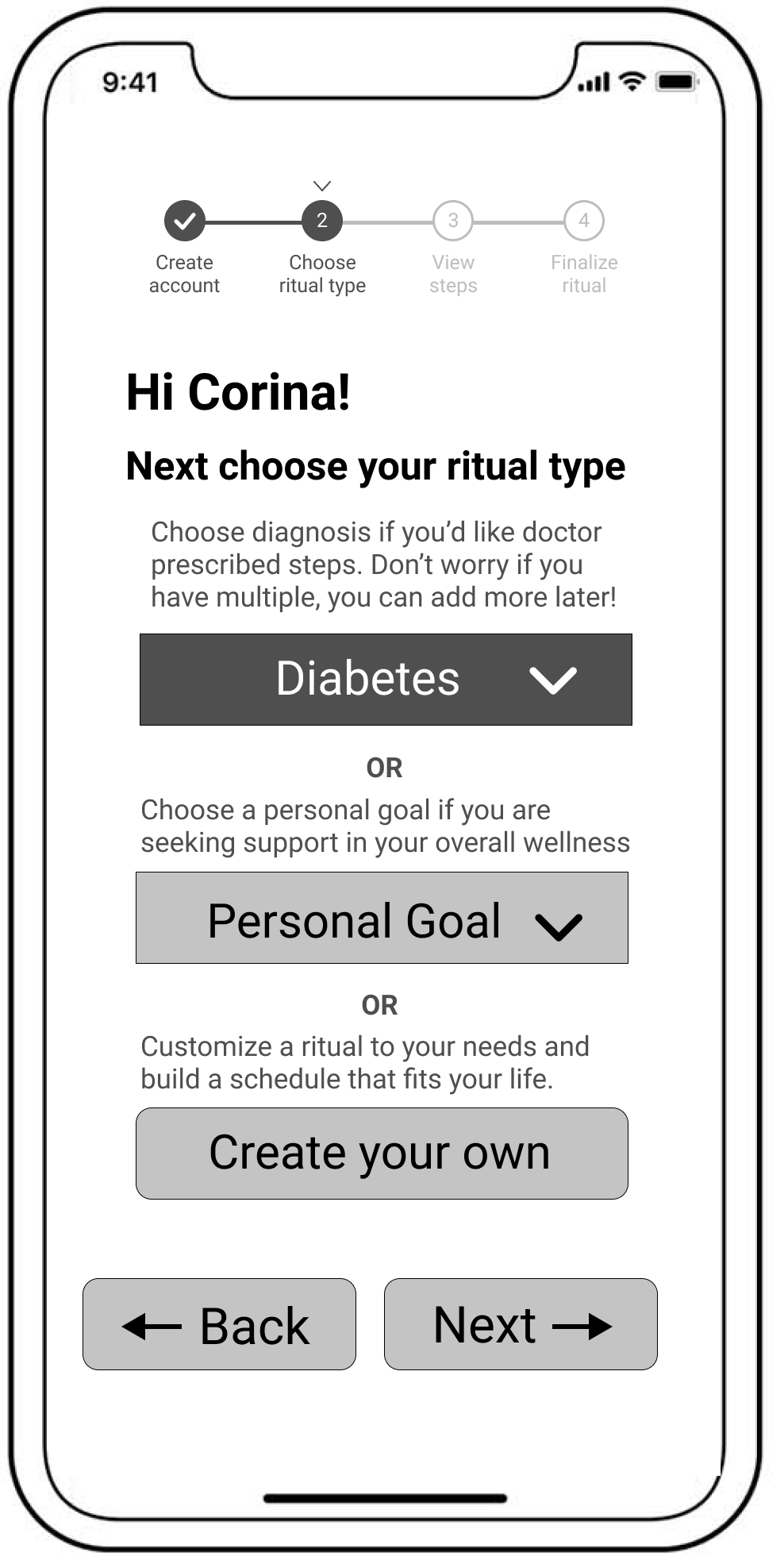
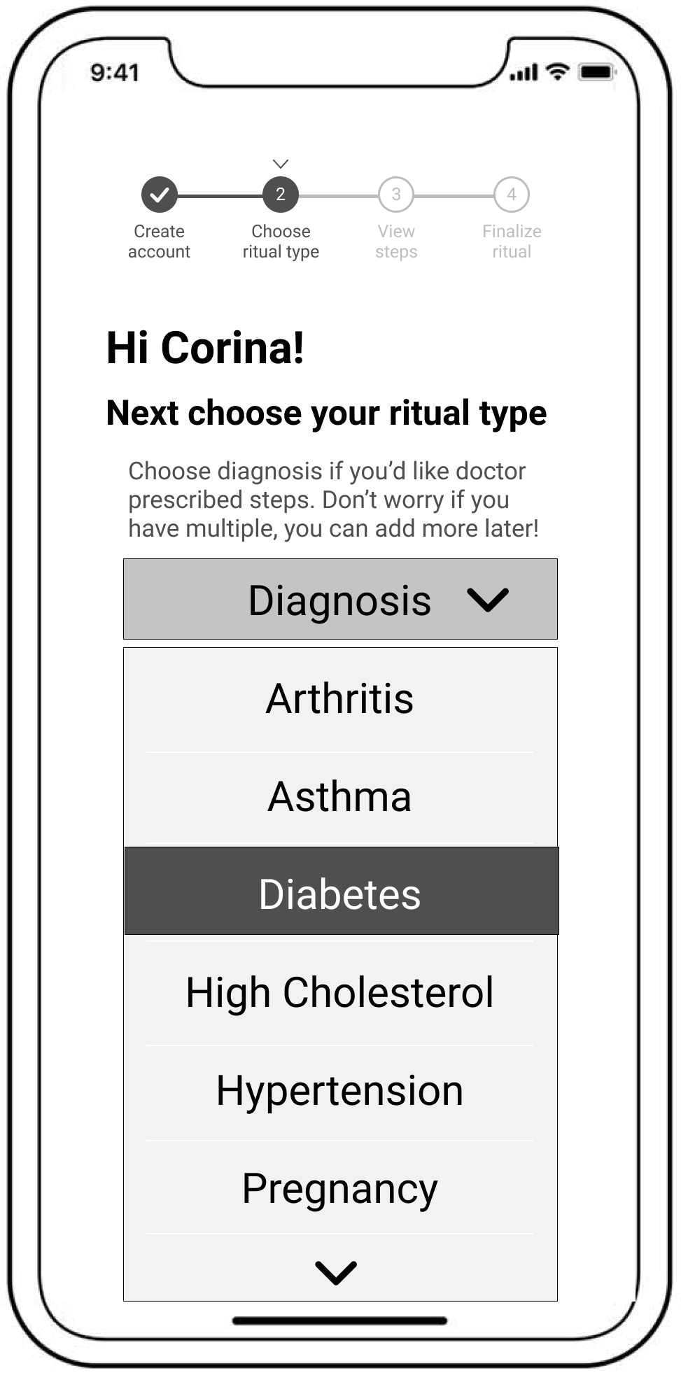
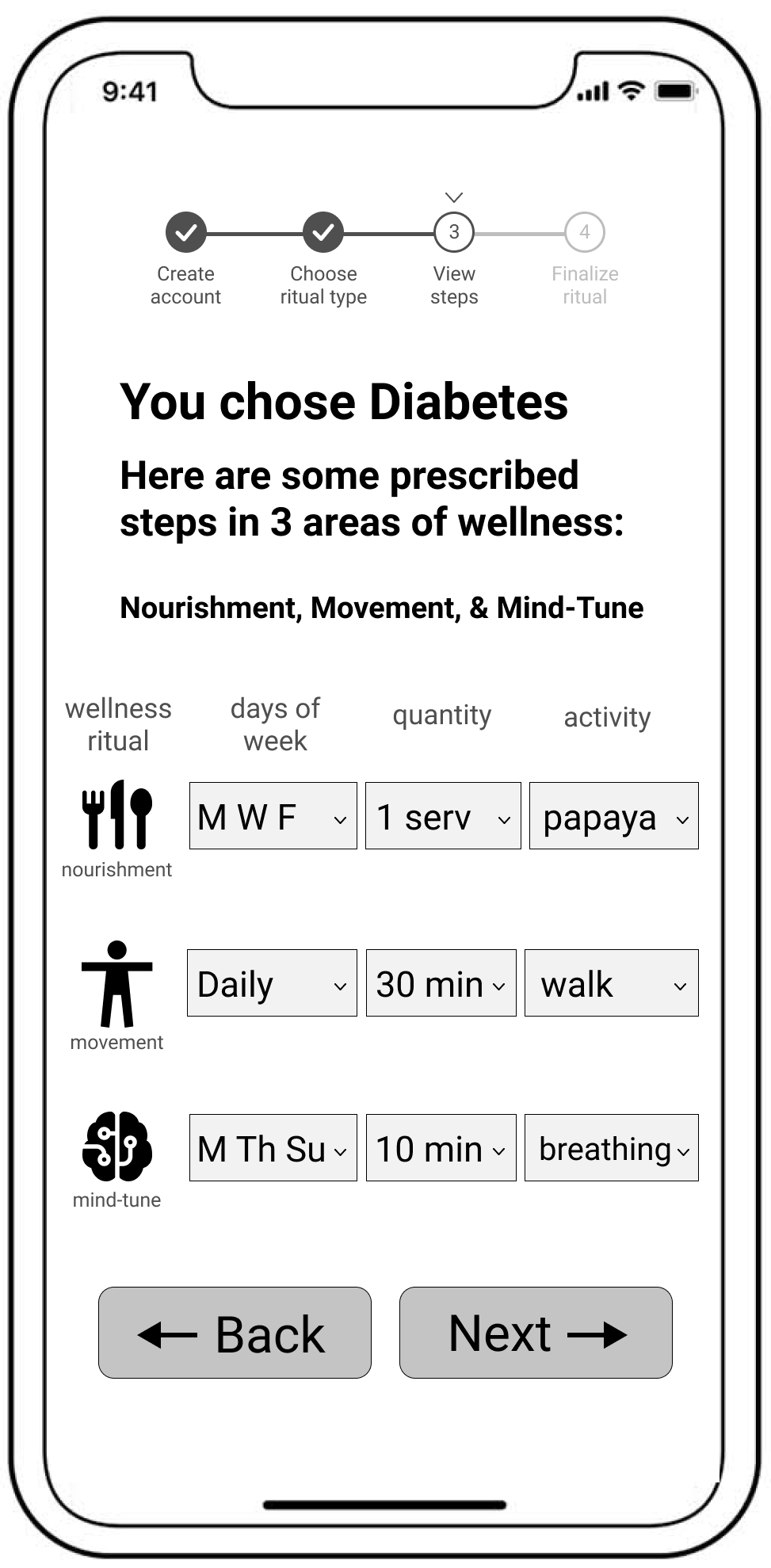
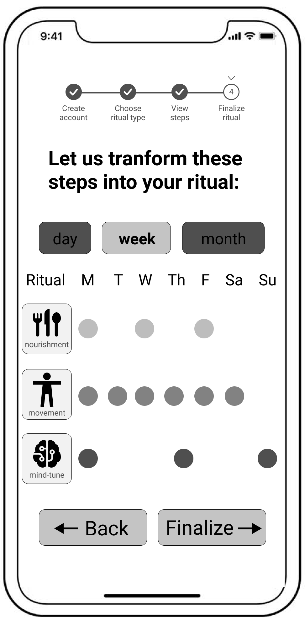
WIREFRAMES
Next, wireframes were built using Figma
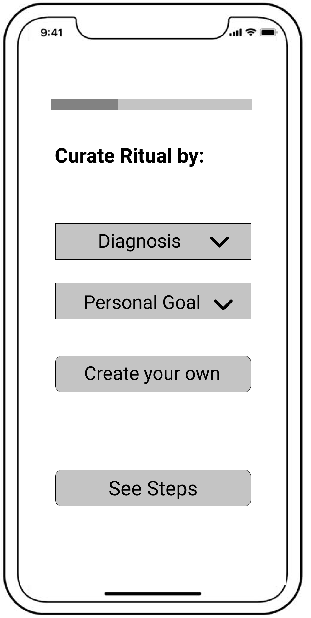
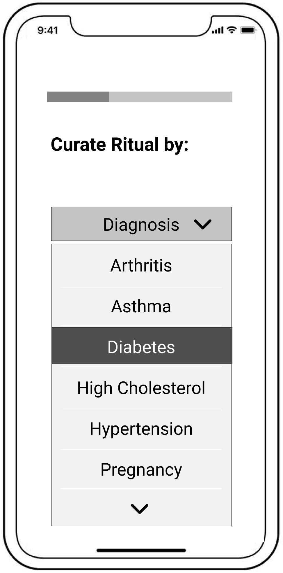
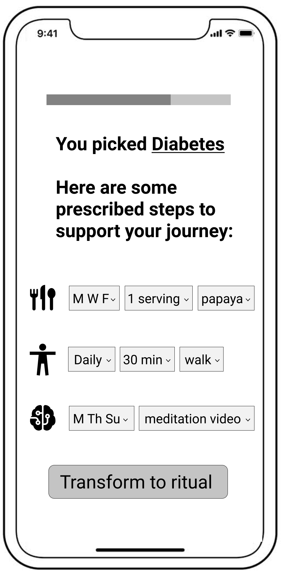
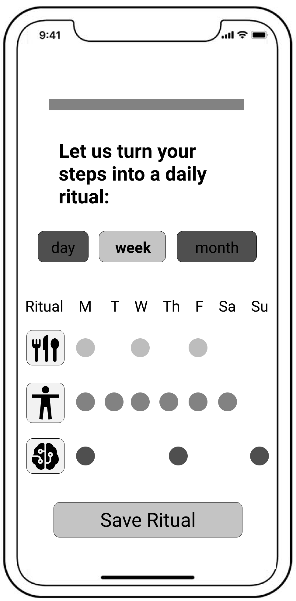
Usability Testing
Generally, I gained overall clarity in building a ritual process. Users wanted more descriptors to help them decide which method to choose and what that would mean for their health. Additional pathways and wireframes were built using feedback.
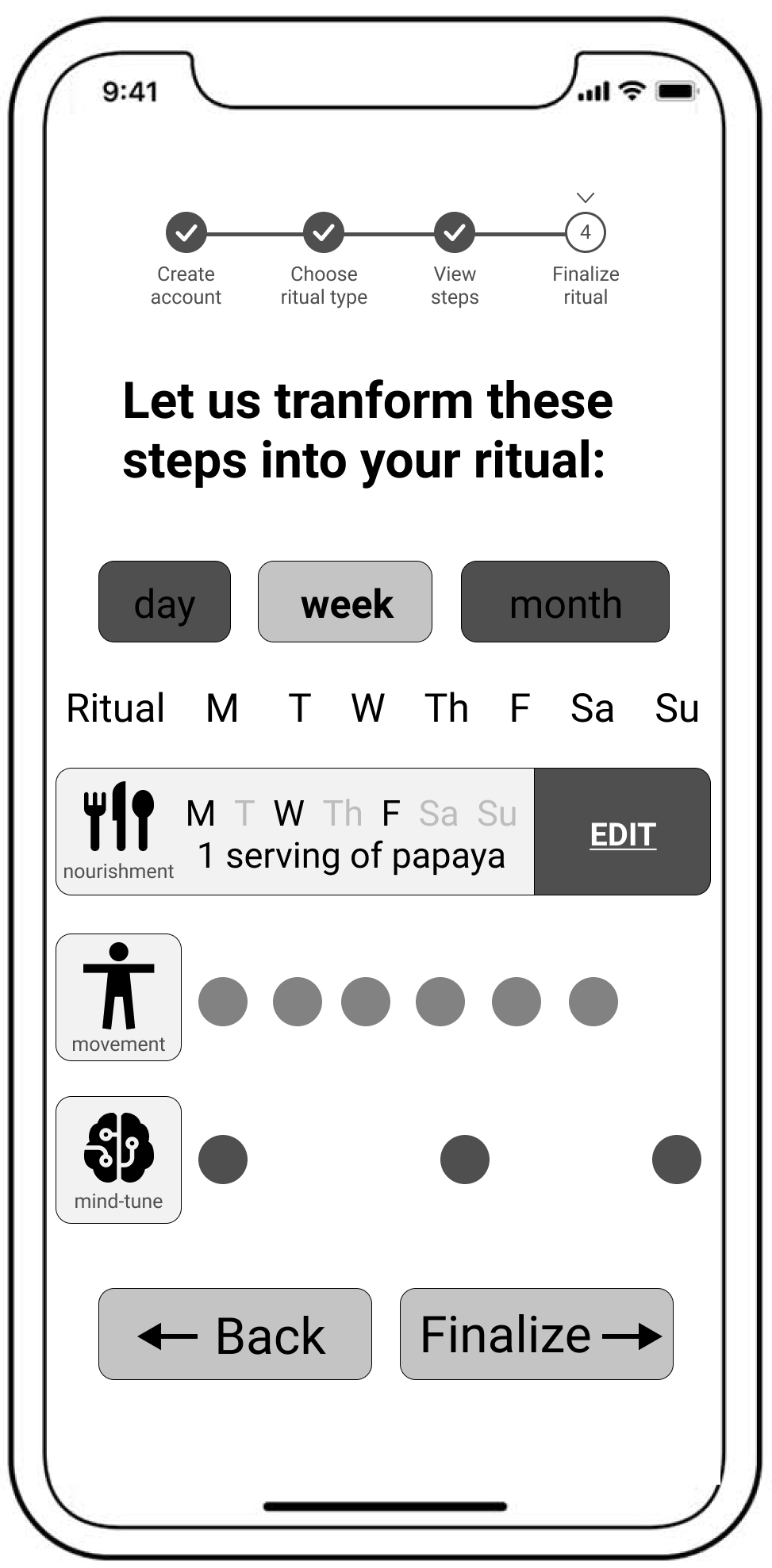
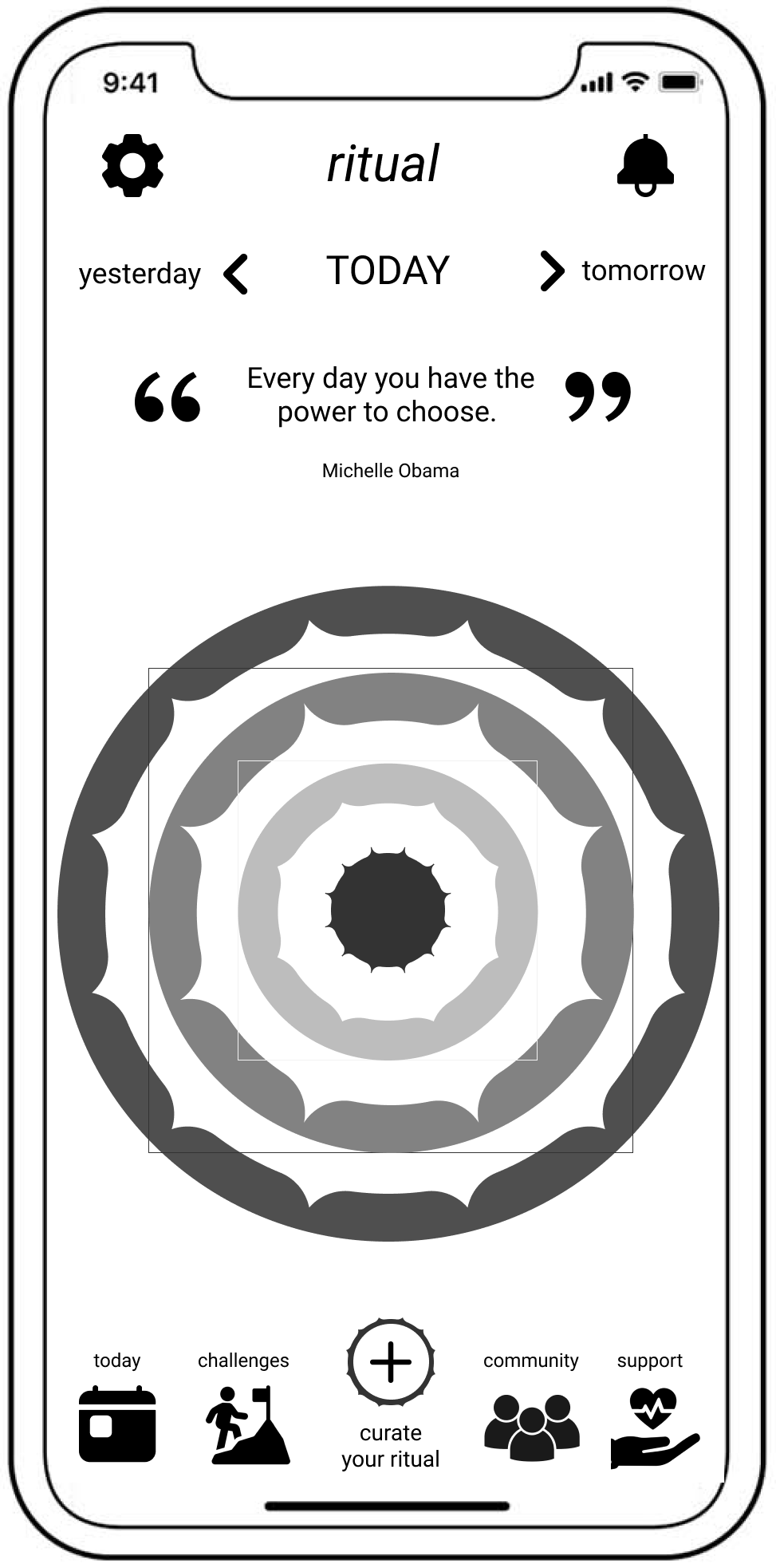
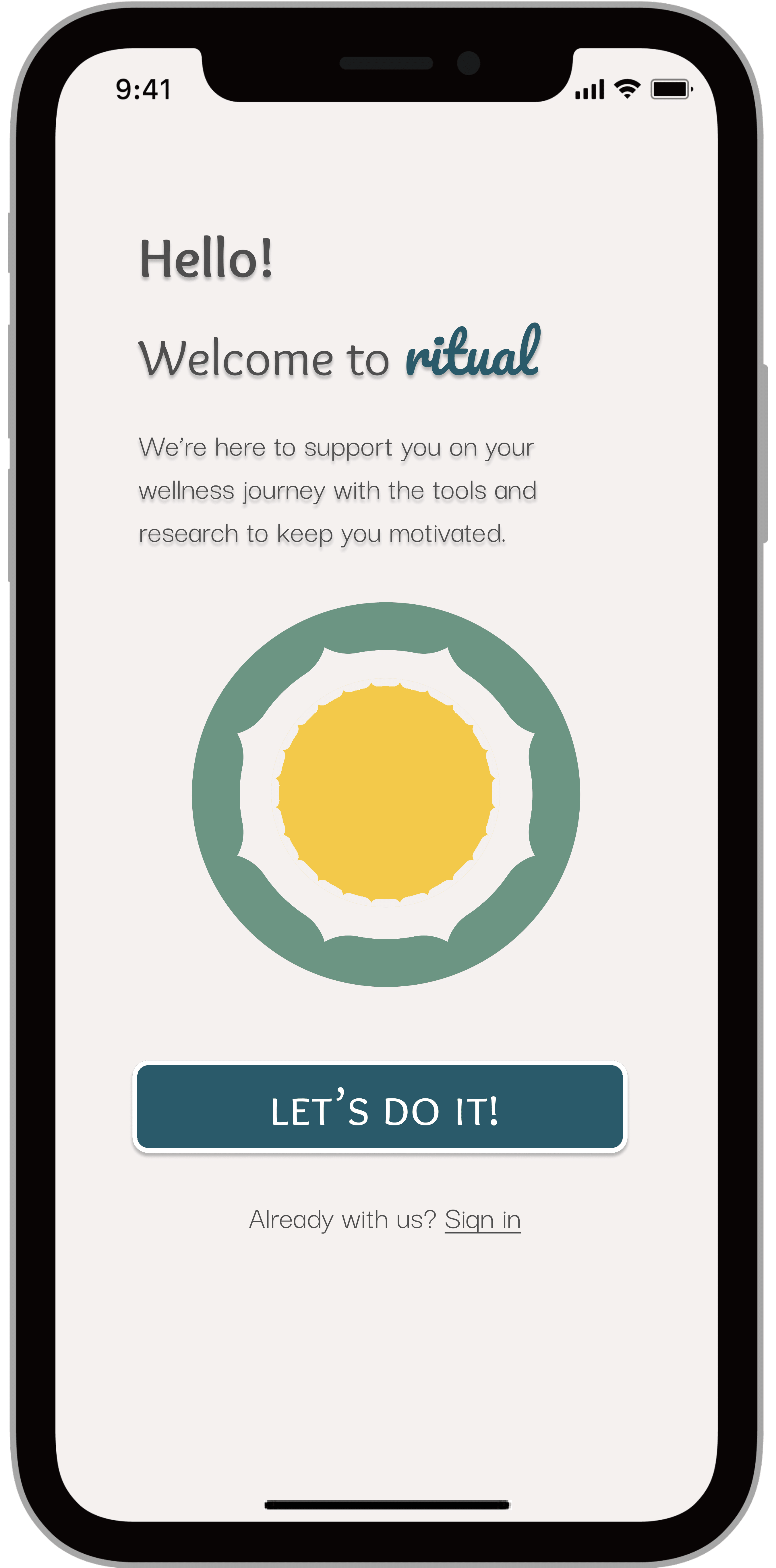
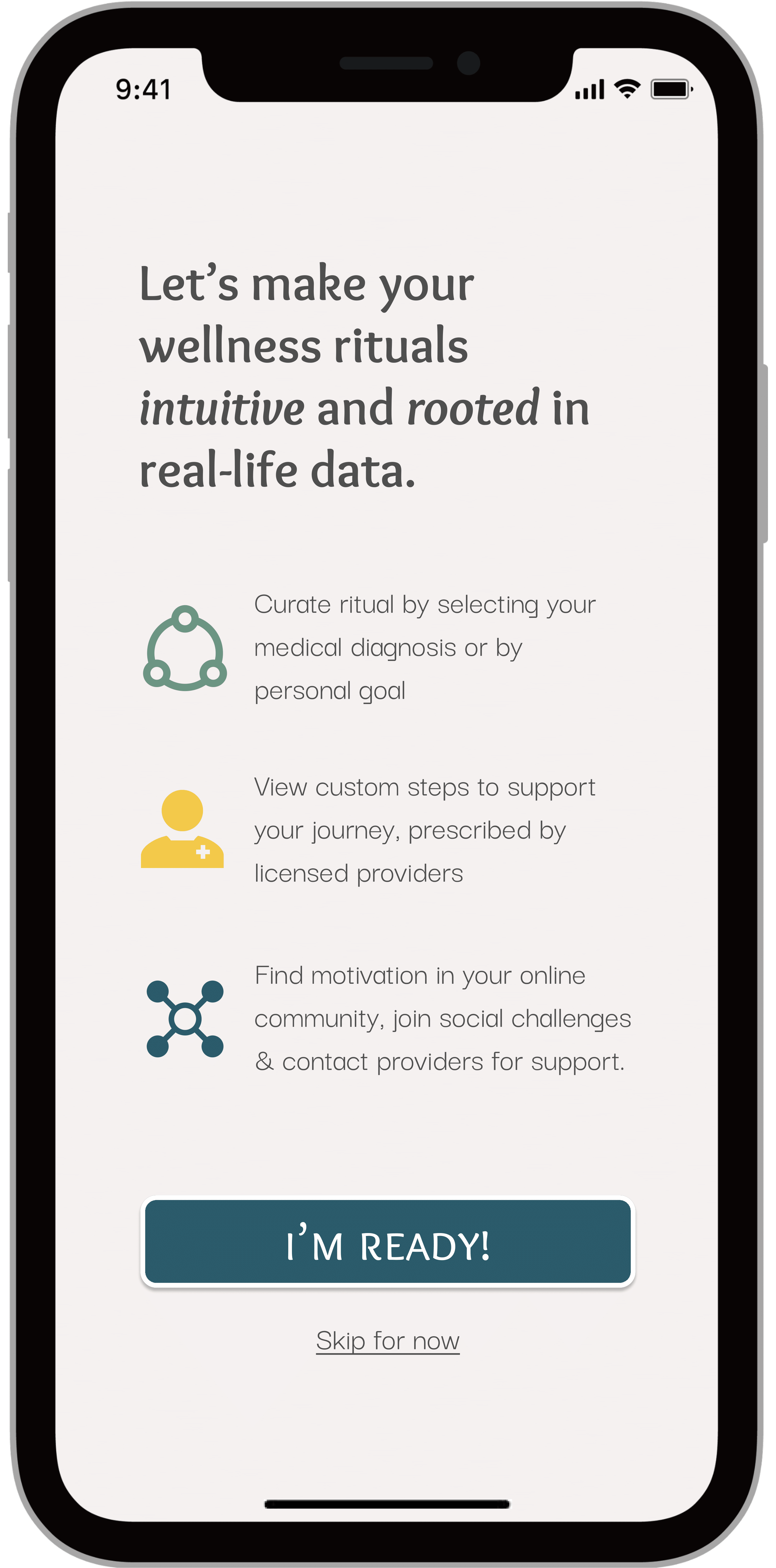
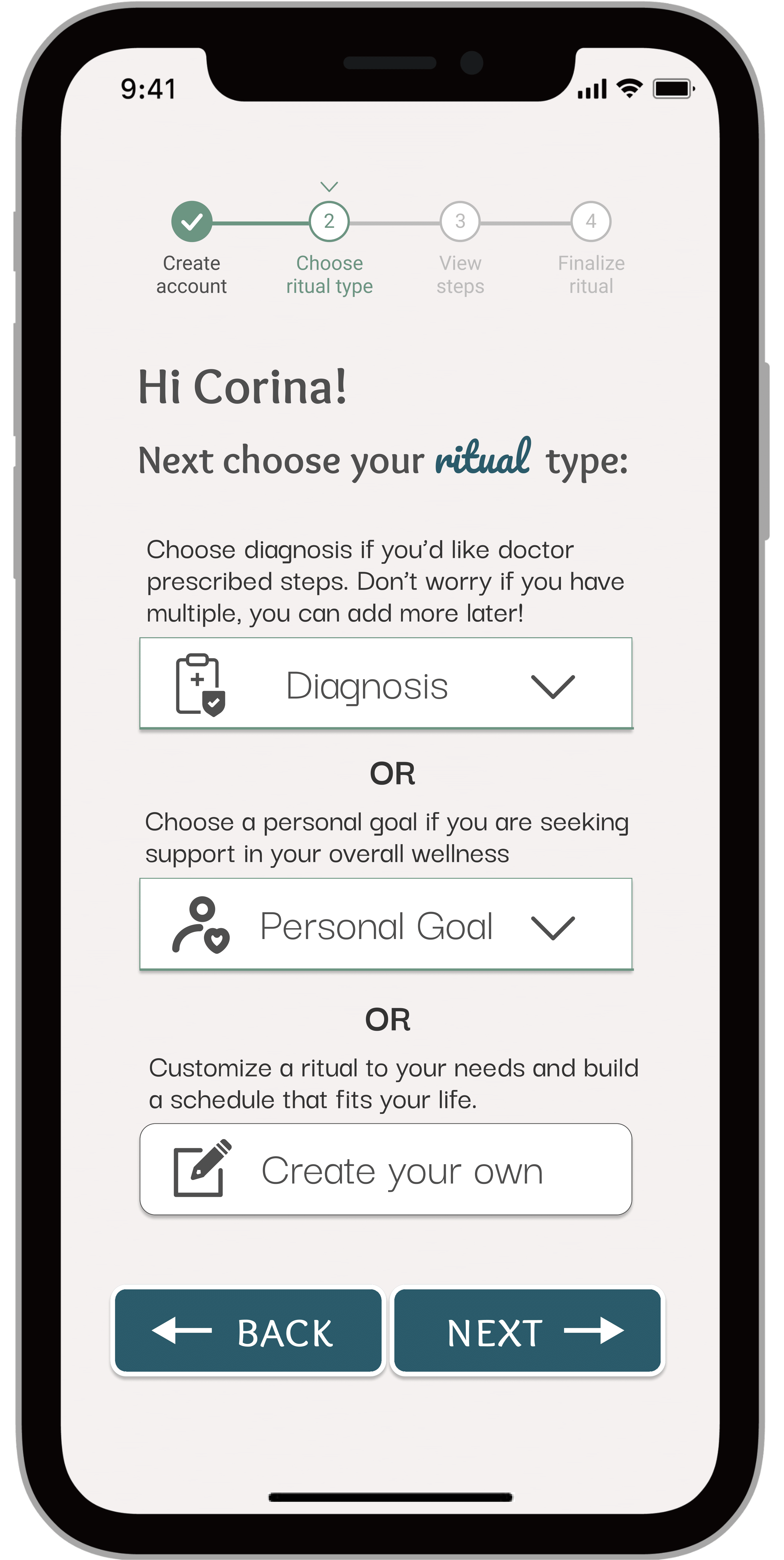
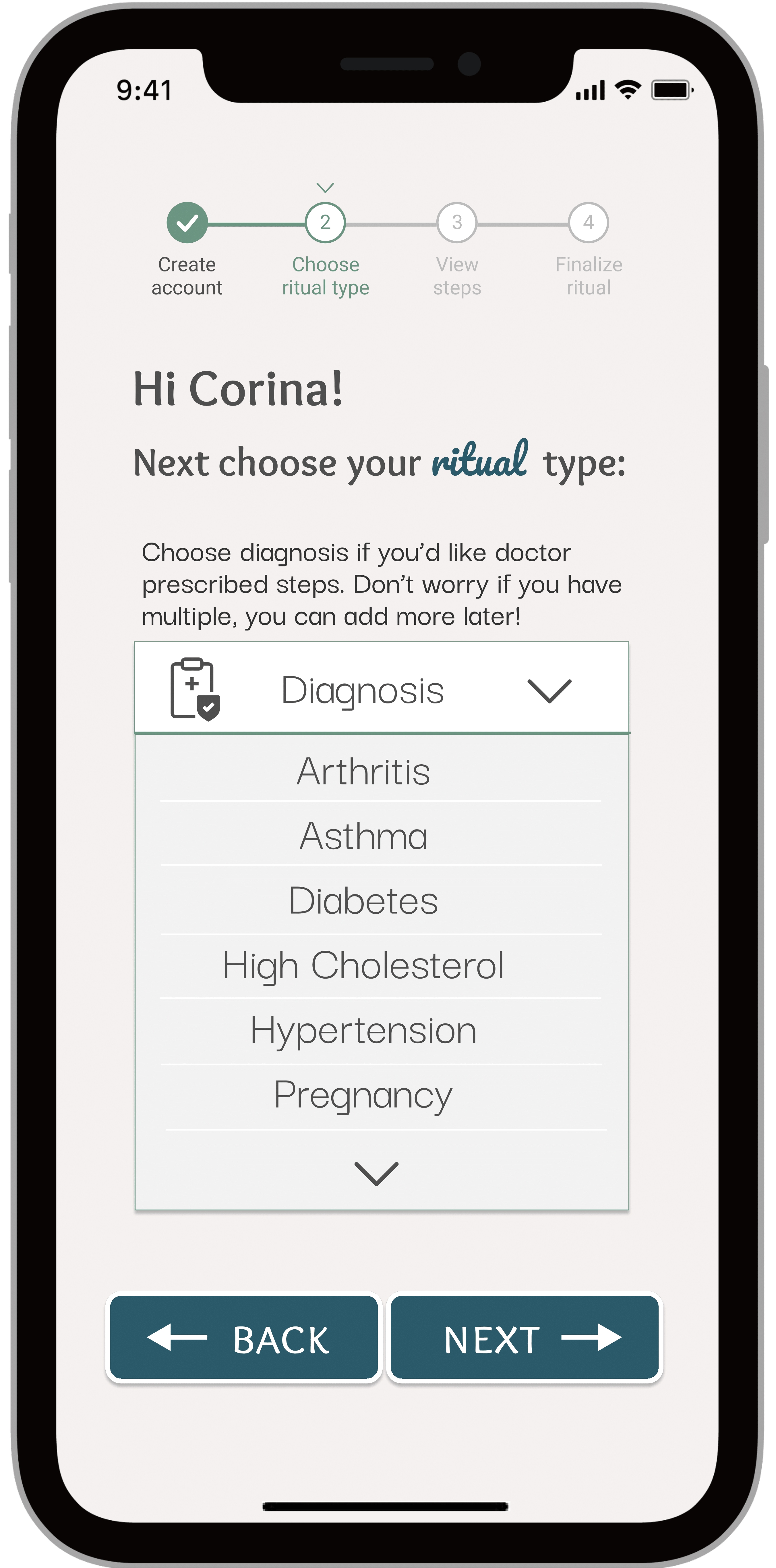
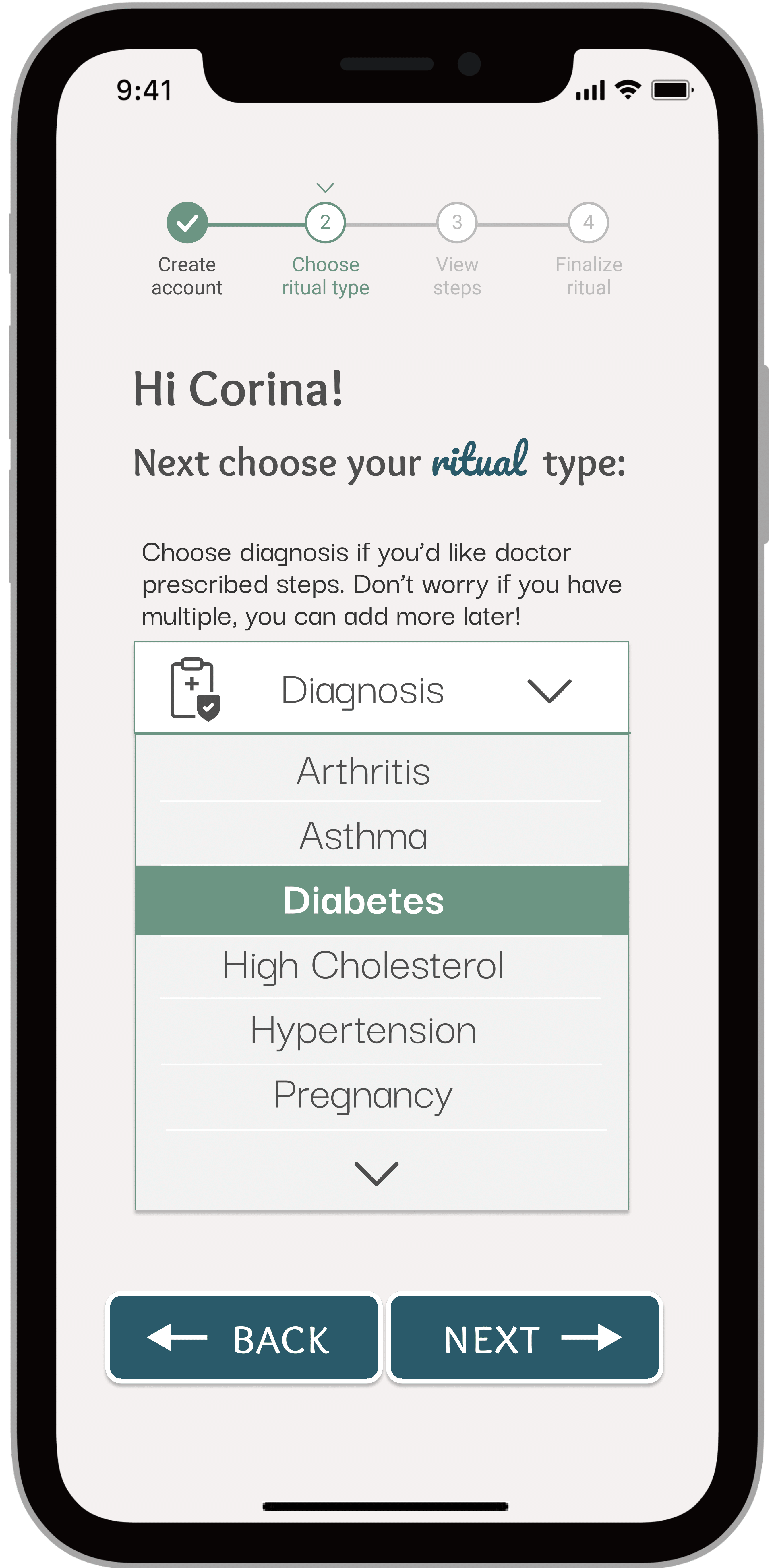
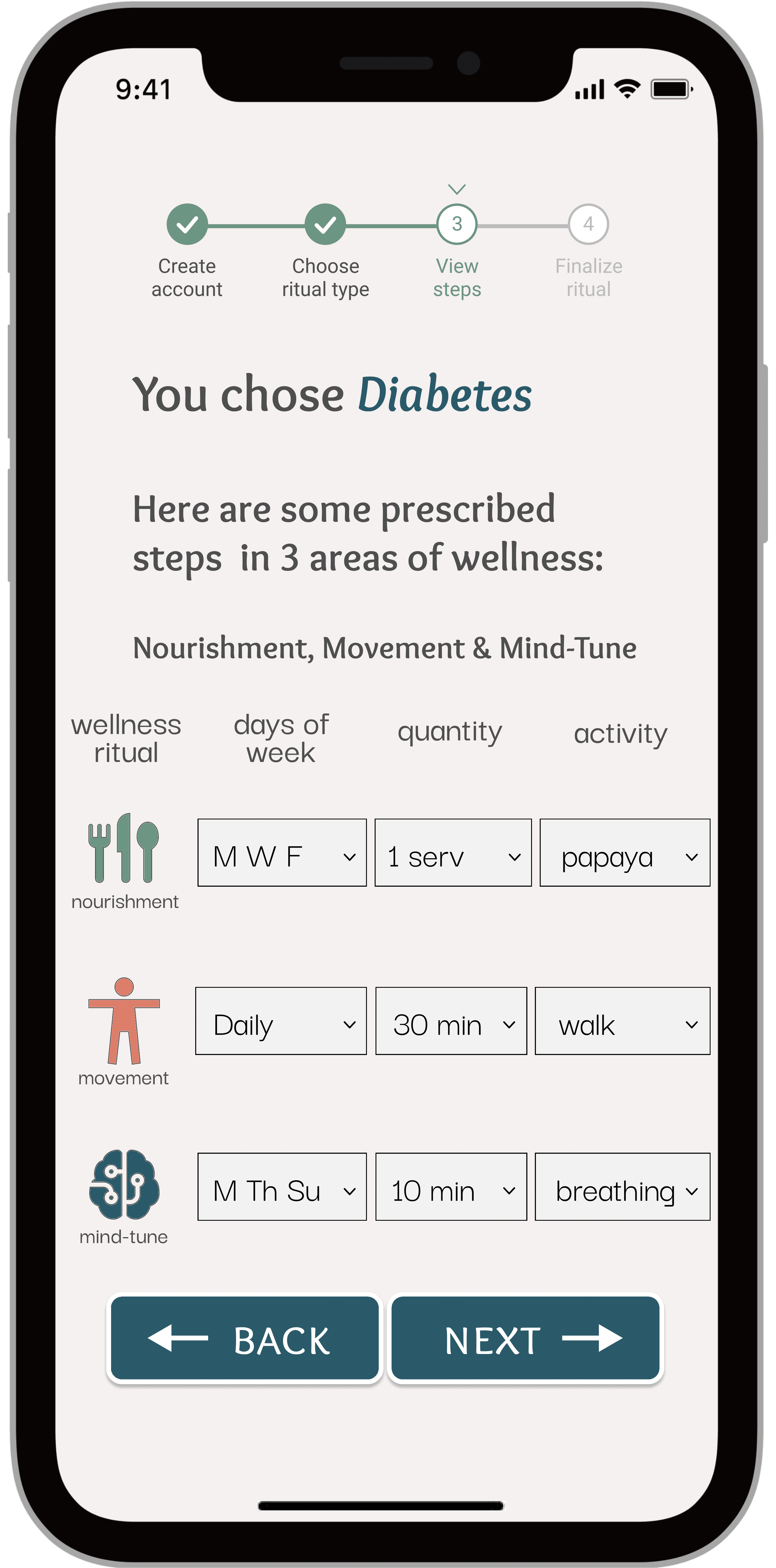
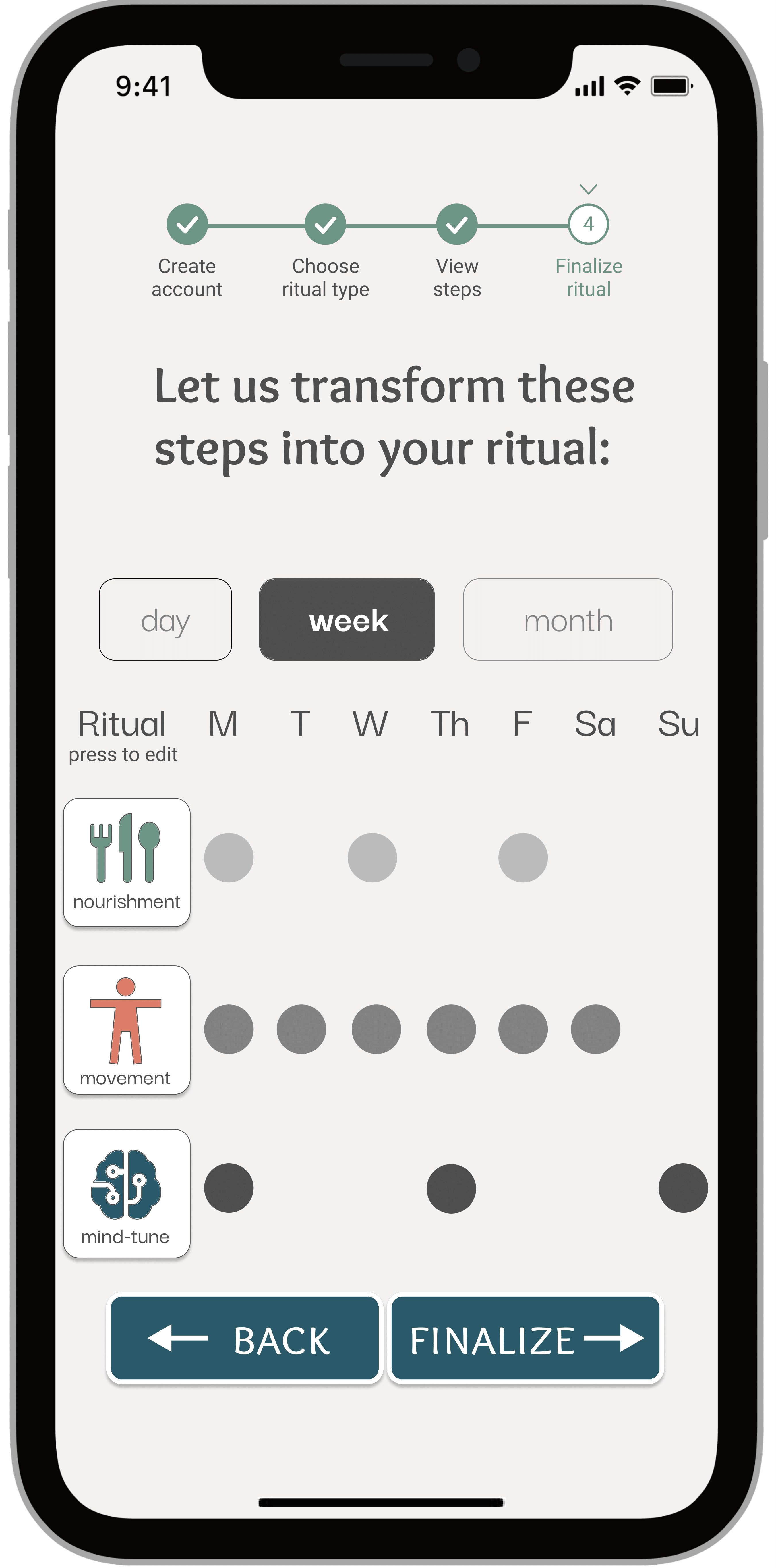
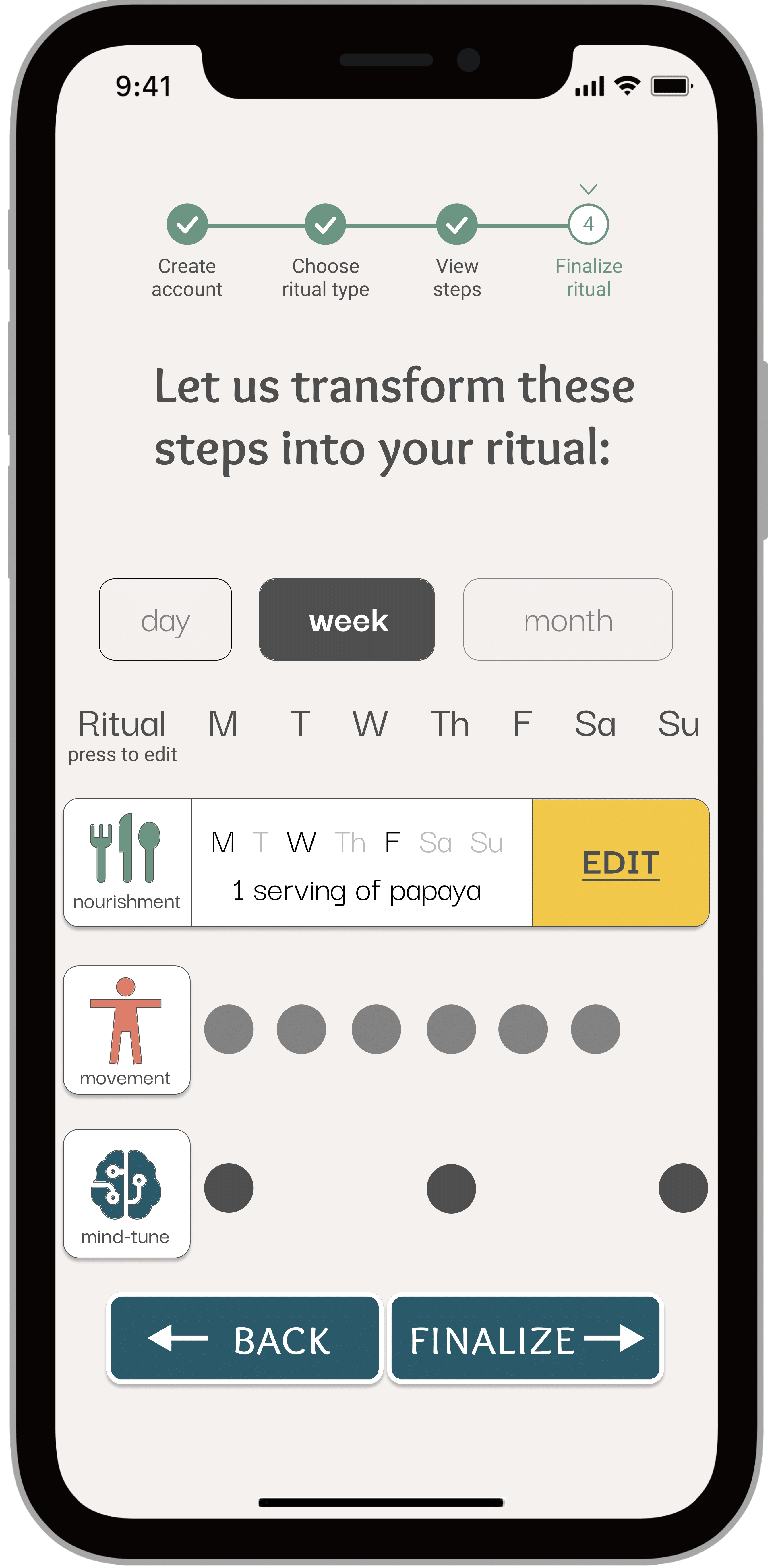
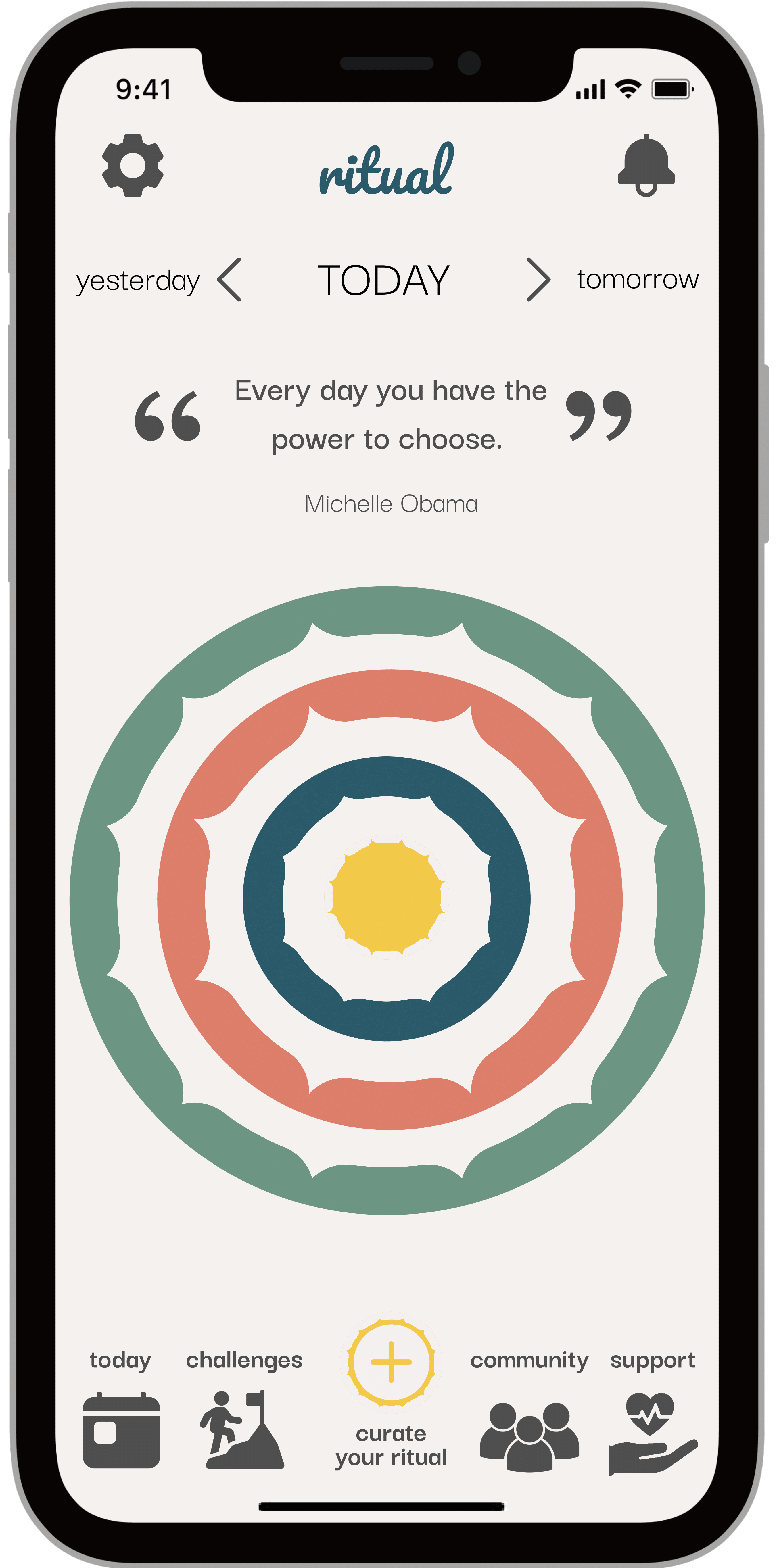
FINAL UI
The design elements were added!


More Projects
WEB • HEALTH COMMUNICATIONS • UX/UI

“That’s been one of my mantras — focus and simplicity. Simple can be harder than complex; you have to work hard to get your thinking clean to make it simple.”
“I think if you do something and it turns out pretty good, then you should go do something else wonderful, not dwell on it for too long. Just figure out what’s next.”


